After a long, good time I had to let go of my Dopplr travel badge. Syncing between services hasn’t been working as flawlessly anymore recently, and it’s a working tool after all, and so with some pain I switch to the Tripit badge.
It’s hideous, or at the very least it doesn’t have a soul, and you can’t granularly select what info to display, both of which make the Tripit badge the far weaker product. (Any good third party badges for Tripit out there?) But on the functional side, Tripit’s fantastic ticket parsing makes info input super easy, and the mobile app is (while also hideous) very functional. I use it all the time and am not aware of any that can keep up.
Dopplr, on the other hand, gave you very granular control. Places visited or trips planned? Check. Include notes on trips? Check. How many trips, and maybe include a map? Check. You get the idea. And everything looked so, so much better, because the team thought a lot about how to best display information. All the way to actually coming up with a system to auto-generate color codes based on the cities you traveled to, which is both useful and beautiful.
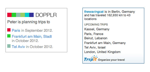
So here they are, the two badges compared. Dopplr left, Tripit right. Now that I can’t use the Dopplr badge, I might just get rid of the badges altogether.
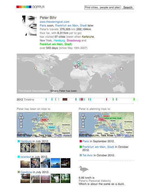
And just for completeness’ sake, here’s the full profile Dopplr would give you. Gorgeous! Boy, I’ll miss it, even though I never made it past the average speed of a duck.
That said, it’s no secret I like it when travel services are built with a love for detail.


