For the last few days I’ve been beta testing Deckset, a Markdown-based presentation tool for Mac built by (among others) Chris Eidhof, one of my partners in UIKonf. (In fact, I believe I might have been user #1, but who knows.)
And boy, Deckset is delightful to work with. As someone who quite regularly, but not all-that-frequently gives presentations, I know my way around Keynote of course, but don’t have the kind of massive collection of slides (or even a cool customized template) that more frequent speakers do. So for me, being able to edit really quickly and to work with some design constraints is just perfect.
To give you an idea just how much of a breeze it is to work with Deckset: You write your text in very simple Markdown syntax into a text file, drop in the picture name, place the picture in the same folder as the markdown file. Done. Editing happens straight in the text file. Again, you save, and you’re done.
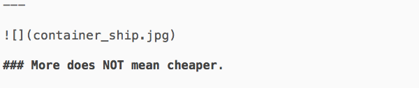
Deckset turns this…
…into this:
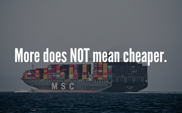 Image by mikebaird, CC by
There are constraints — lots of constraints — in what you can do in terms of layout. It’s Markdown, so it’s pretty basic: Headers, lists, bold and italic, that kind of thing. Deckset does the rest.
Deckset comes with a selection of templates, and you can tell that a team of (I say this as a compliment) total type nerds built it – the templates look gorgeous. The first preview (1.0) came with something like 4 templates of 3 color combinations each; this morning’s update (1.3) brought it up to 4 templates and 4-7 color combinations each. They range from very serious/timeless (“Classic”) to one alluding to the era and style of Mad Men (“Swiss”) to quite bold (“Poster”) to playful (“Superfun”).
It’s all about image + text, so the team had to come up with some solutions on how to handle images in very different ways: Where the Poster theme leaves the images more or less as vibrant as they are and just throws large, bold-ish typeface on top, the Swiss theme pushes the images more into the background, converted into grayscale and overlaid with a single color, so it’s more focused on the type. The Modern theme is somewhere in between: Images stay in color, but are blurred to serve as background more than as images. Switching between themes happens on the fly, no re-rendering necessary.
Oh yes, Deckset also supports clickers and does PDF exports of course.
So who is Deckset for?
Deckset is for… anyone who regularly does presentations and likes to edit them very simply on the fly. If you just occasionally do presentations and want them to look great without using the Keynote standard templates, Deckset is great too.
Deckset is not for… speakers who have their own custom-made templates and are very invested in their collection of Keynote slides, or who need to show videos as part of their presentations.
Why the long write up? For one, when friends build great tools it’s worth a shout out. More importantly, Deckset is a great tool to for me, and I’m going to test it in the field next week for a talk in Amsterdam (so it’d better work!). I’m not sure when Deckset will be out officially, but the moment it is I’ll be the first in line to pay for my copy.
You can sign up for the invitation list on decksetapp.com.
Full disclosure: I’m currently using the app for free as a beta tester.