If you use a web service and encounter an error, it’s bad enough as it is. Don’t make your users guests suffer even more by giving them a cryptic error page with technobabble. Most people won’t mind an error if they’re offered a helping hand. Here’s a few nice examples of great error page designs:
 istockphoto.com: Maintenance page. Awesome.
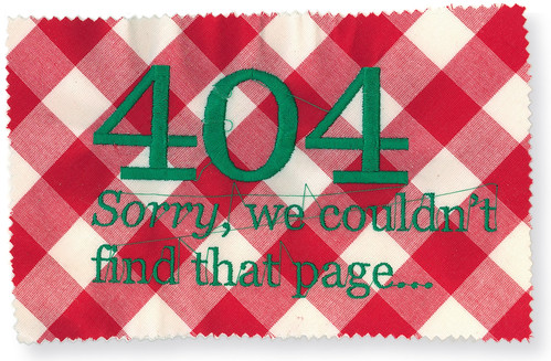 Picnic Network has this great File Not Found page, themed accordingly. Screenshot by willem_velthoven.
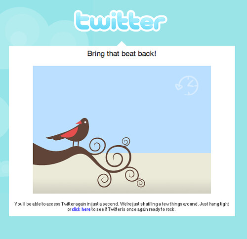 One of Twitter’s many awesome error pages that make it almost enjoyable to watch the service during downtimes. Screenshot courtesy of Peter Glyman.
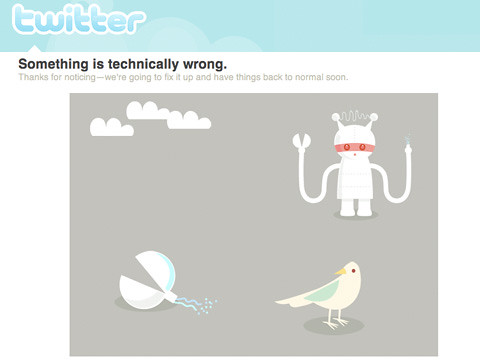 Another error screen by Twitter, also great. Screenshot by ijustine.
All of these have one thing in common: They’re all beautiful, smart & funny. What more can you ask from a bad news message?
Ps. As usual, he who complains so loud isn’t much better than the folks he criticizes: My own file not found page could use a little overhaul as well. What did I try to do with all the stuff going on there? First, a link back to the start page. Then I opened up a communication channel, in that case by asking for email feedback. My brief video message comes by the way of a personal greeting, but admittedly was also a good excuse to play around with Seesmic. Finally, at the bottom there’s a brief video I hope is entertaining: Technology, Phooey” featuring The Ant and The Aardvark.
Ideas, recommendations or other really god (or bad) examples? Please share.